English
 English
 Español
What Are You Looking For?

Tongyuan Electronic Co., Ltd.


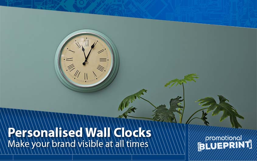
A well-designed custom wall clock does more than tell time—it anchors your brand in every glance. In retail spaces, offices, cafés, and clinics, a clock can quietly deliver thousands of impressions a day while improving the environment’s professionalism and flow. Here’s a practical, step-by-step guide to designing a custom wall clock that’s beautiful, legible, durable, and true to your brand.
Define the job of the clock before you sketch anything.
Primary goal: décor statement, wayfinding, campaign promo, or corporate identity?
Placement & distance: reception, cash wrap, aisle endcap, meeting room. Estimate the typical viewing distance to size the dial, numerals, and logo.
Audience needs: quiet for clinics/libraries; high-contrast for schools/warehouses; premium finishes for hospitality.
Deliverable: a one-page brief covering size, location, brand guidelines, timeline, and budget.
Analog vs. digital
Analog: timeless, décor-friendly; choose if you want a softer interior feel.
Digital: at-a-glance precision, large numerals; great for retail back-of-house, production floors, or modern interiors.
Shape & size
Round (Ø 30–35 cm) suits most interiors; square/rectangular feels modern/architectural.
For long viewing distances, scale up to Ø 40–50 cm or pick large-digit digital models.
Lens
Acrylic/PC: lightweight and shatter-resistant; glass: premium feel and scratch resistance.
Specify anti-glare for bright, windowed spaces.
Numerals/markers: Arabic numerals are fastest to read. If you prefer minimalist markers, keep them bold and evenly spaced.
Hands: high contrast against the dial; avoid ultra-thin hands. Consider a sweep second hand (silent) where precision or calm ambience matters.
Contrast & color: lock in strong foreground/background contrast (e.g., dark hands on a light dial). Avoid low-contrast brand palettes on critical info.
Hierarchy: time first, logo second. If you add calendar/temp icons, keep them small and peripheral.
Quick sizing cue: plan text/mark heights for legibility at your target distance; test prints on the wall at 1:1 scale.
Logo size: target 10–20% of the dial diameter; don’t crowd numerals.
Placement: top center or lower center; keep a safe area so hands never obscure the mark.
Brand color fidelity: request PMS/spot color matching or calibrated CMYK/UV printing; consider raised or metallic logos for premium editions.
Dial finishes: matte ink for legibility; selective gloss or embossing for subtle depth.
Quartz step: traditional ticking; fine for busy areas.
Quartz sweep (silent): ideal for bedrooms, clinics, libraries, studios.
Auto-sync options: radio-controlled or Wi-Fi/NTP for multi-site accuracy and daylight-saving auto-adjust.
AA batteries are simple and widely available.
USB-C or rechargeable options reduce battery swaps in high-mount locations.
Add a low-battery indicator and include a maintenance note in your rollout SOP.
Housings: ABS for light weight, metal for premium, wood veneer for warmth.
Backplate & mounting: include sturdy keyhole mounts and wall anchors; consider a paper drilling template in the box.
Durability: UV-stable inks and anti-yellowing lenses extend life in sunlit windows.
Wi-Fi/NTP sync for fleets across stores or offices.
App or web panel to set time zones and DST policies.
Brand content on digital models (welcome screen, QR to loyalty program).
Request relevant compliance for your markets (e.g., RoHS/REACH; CE/FCC for connected models).
Include manuals, warranty terms, and an inspection checklist in every carton.
Branded box with a clean product shot and key benefits.
Protection: corner buffers, anti-scratch film, and drop-tested inner trays.
What’s inside: clock, mounting template, screws/anchors, quick-start card, and (optionally) batteries.
Place a QR code or short vanity URL on the dial backplate or packaging to track sign-ups or redemptions.
Use limited-edition dials for campaigns; measure lift via code usage or staff/customer recall surveys.
Design
Size & shape: ___
Analog/Digital: ___
Dial layout: numerals / markers / minimalist
Hands: hour/minute color ___; second hand sweep/step ___
Logo: placement ___; diameter % ___; finish (UV/metallic/emboss) ___
Colors: PMS/CMYK refs ___
Lens: glass / acrylic / PC; anti-glare? ___
Engineering
Movement: step / sweep / radio / Wi-Fi/NTP
Power: AA / USB-C / rechargeable
Materials: housing ___; backplate ___
Mounting: keyhole / bracket; hardware included? ___
Indicators: low battery / DST / sync status ___
Quality & compliance
Accuracy test, hand alignment, noise test (silent areas), color proof
Certifications required: ___
AQL/inspection plan: ___
Packaging
Branded box, protective inserts, wall template, manual, warranty card, spare battery (optional)
Concept & artwork: 3–7 days (faster with full brand kit).
Sampling: 7–14 days for printed dials; longer if custom tooling/hands.
Mass production: typically 15–35 days depending on volumes and finishes.
Key cost levers: size, materials, printing method, custom hands/bezels, smart modules, packaging complexity.
Low contrast between hands and dial.
Oversized logos that clash with numerals.
Choosing ticking movements for quiet zones.
Skipping 1:1 wall print tests before sampling.
No plan for mounting hardware or maintenance.
Designing a custom wall clock is equal parts brand craft and industrial detail. Prioritize legibility, material quality, and long-life finishes; then layer in brand character through color, logo, and subtle textures. The result is a hardworking brand asset that looks great and performs every single day.
If you’d like help, VirtueTime Electronics offers OEM/ODM support—from dial design and color matching to silent movements, smart time-sync, packaging, and multi-site rollouts. Share your brief and we’ll prepare a design mockup and sample plan.


 IPv6 network supported